
Glassbox Media
Website Re-Design
2024
Background Context
Glassbox Media is a start-up that partners with established podcasters, managing ad sales, brand partnerships, and marketing through the Megaphone platform. The company handles business logistics like ad placement and promotion while leaving content creation to the podcasters. Focused on supporting sustainable growth, Glassbox serves as a resource for creators and brands aiming to reach podcast audiences.
View the live website here 🔗
1. Introduction
Glassbox media is a podcast network that helps podcasters monetize their podcasts through ad sales and marketing strategies. The Glassbox website aims to appeal to podcasters who are considering joining our network by using engaging visuals and clearly communicating the network’s value.
2. Problem Definition
Surveys of 10 podcasters revealed that Glassbox’s site lacked clarity in services and visual appeal. Feedback received described it as “bland yet busy” and missing the excitement and clarity that potential partners expect. Additionally, the messaging didn’t clearly define Glassbox Media’s unique offerings. As a result, some podcast creators felt uncertain about the network’s benefits.

screenshot of the original site

some feedback from preliminary questionnaire
3. Research Process
To guide the redesign, I conducted surveys with podcasters currently signed to the Glassbox network and completed a competitive analysis across two areas:
Analysis of Podcast Networks: I analyzed The Podglomerate, Lemonada, and Podcast One, focusing on their layouts and messaging strategies.
Key insights: These sites establish credibility immediately.

example of Lemonada using star power immediately on their front page to establish credibility
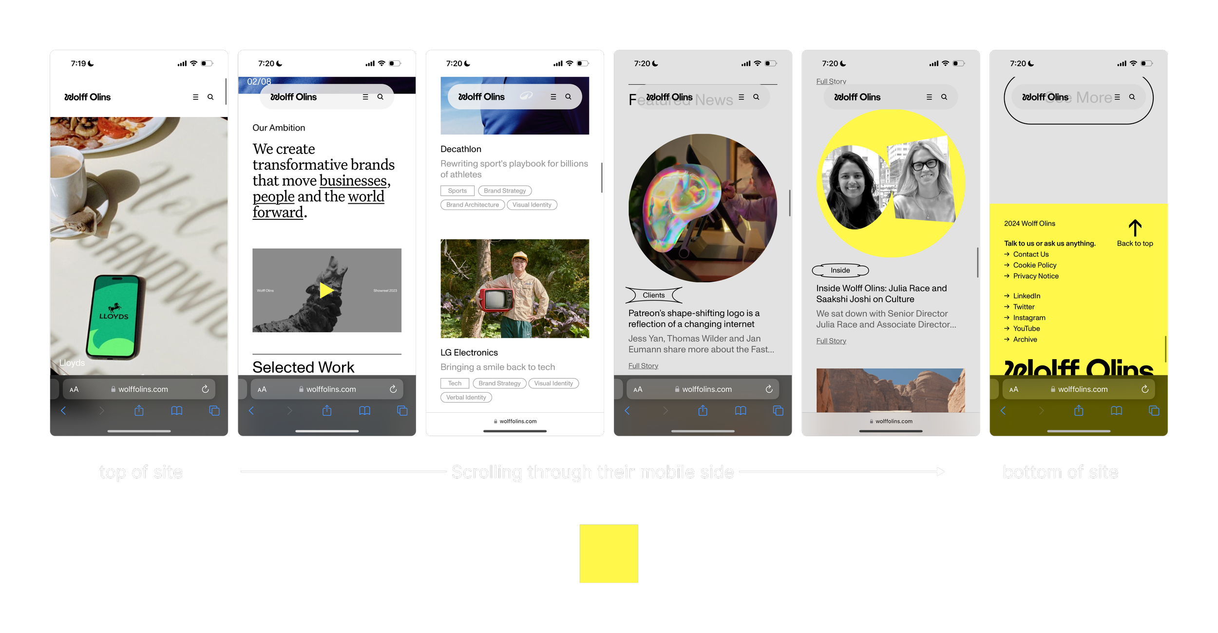
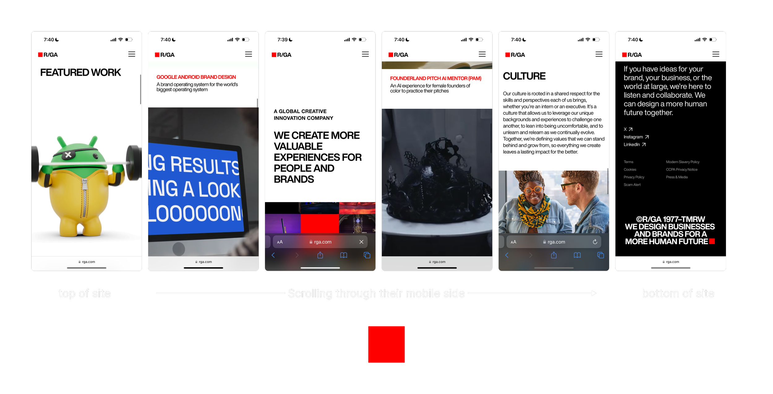
Analysis of Visual Design Studios and Agencies
Examined Wolff Olins, RGA, and Huge for visual inspiration beyond industry norms.
Key insights: Strategic use of brand color, structured layout, and visual elements created an impactful brand presence that I applied to our redesign.
sparing use of the intense yellow brand color has greater visual impact
sparing use of the intense red brand color has greater visual impact
4. Design Process
Branding and Guidelines: Building on existing brand elements (red, white, black colors, Tommy Bold typeface), I expanded the brand’s color palette to diversify the look and expanded the weights of brand typefaces to create a more robust typographic hierarchy. This expansion will allow flexibility across platforms and channels as the brand uses. i.e. social media and print.
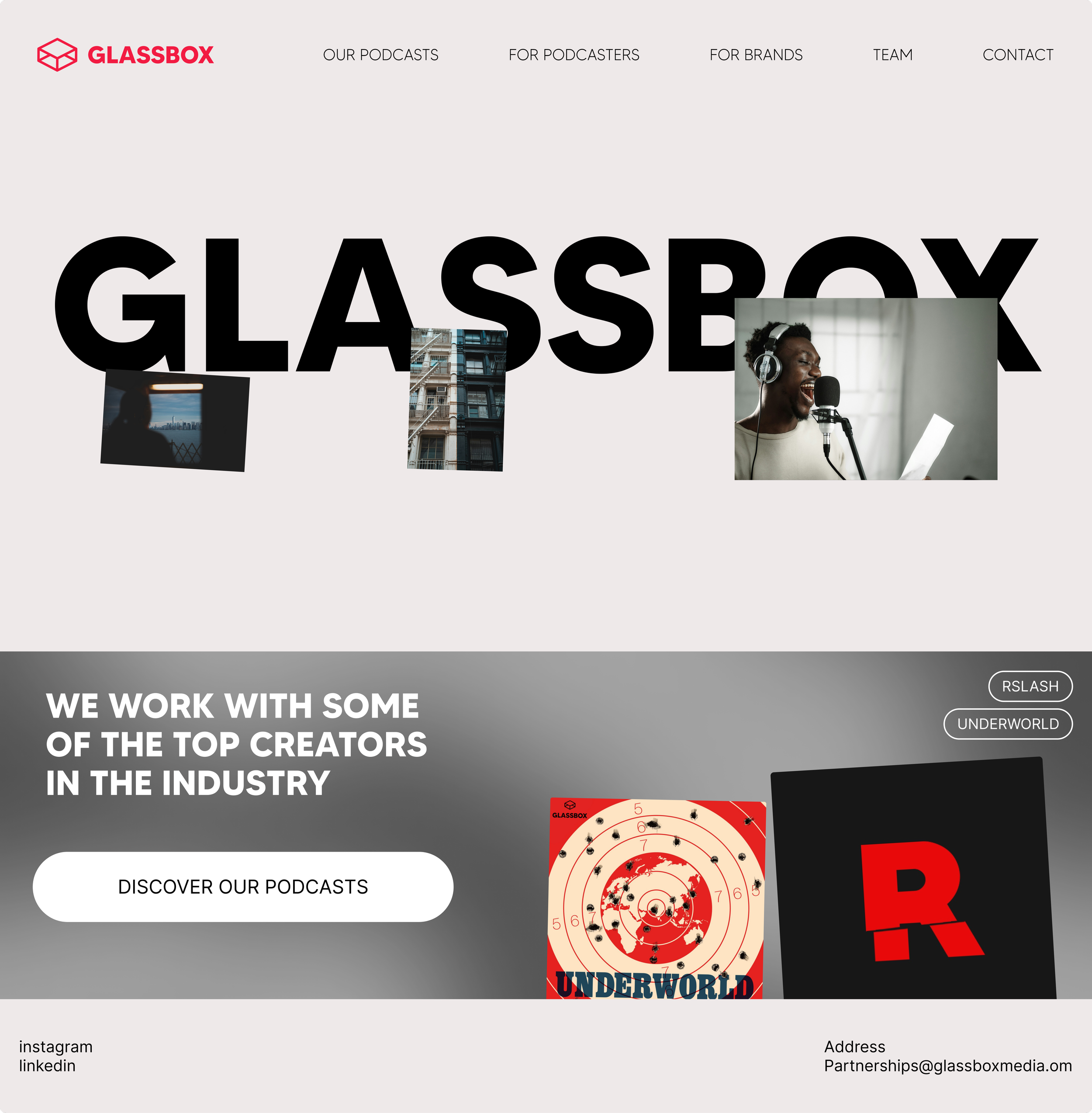
Wireframes and Initial Designs: Early wireframes focused on simplifying the layout to streamline navigation and reduce unused space. Key information, like “How We Grow Your Show,” was positioned prominently on the homepage, immediately establishing Glassbox’s purpose and value.

early wireframes of the podcast page with notes to self
Visual Aesthetics: New icons and illustrations gave the site more tools other than photography to communicate with its' audience.With the expanded color palette, brand colors like red were able to be used more strategically in order to have impact and emphasis.

simple black icons add some visual interest to the highlights of what the company does
5. User Experience (UX) Approach
User Flow: I restructured the user journey to ensure that prospective podcasters could seamlessly navigate from learning about Glassbox’s services to inquiring about joining the network. To reduce barriers to entry, I removed the original mailto link and replaced it with a dedicated contact page. This eliminates usability issues often caused by mailto links and avoids extra clicks for the same outcome. Additionally, structured call-to-action buttons guide users through each step, ensuring clarity and easy navigation.
Content Strategy: Feedback highlighted that the site didn’t clearly establish Glassbox Media as a podcast network. To address this, I integrated direct messaging that prominently defines Glassbox’s role and how it supports creators with hosting, ad sales, and show growth. Using the phrase “Podcast Network” on the homepage helps potential partners immediately understand Glassbox’s core offerings.
Establishing Credibility on Homepage: by highlighting the most popular shows we work with on the home page and the well-known brand partners we work with, we establish more immediate credibility in fewer clicks.
6. Challenges & Solutions
Challenge 1: Large font sizes cluttered the layout, making the site feel generic and unfocused.
Solution: Reduced font size for non-headline text to create a more streamlined and cohesive appearance.
Challenge 2: Excessive negative space and stark white backgrounds resulted in a sparse, cold, and uninviting layout.
Solution: I added icons and images to fill space and provide visual cues for important content. I also changed the background from stark white to a subtle beige, adding warmth and making the layout feel more inviting.
8. Outcomes
The redesigned website is expected to better engage prospective podcasters, increase inquiries, and, as a result, increase the number of podcasters Glassbox signs to the network. Enhanced messaging and visuals will build trust in Glassbox’s ability to support and grow podcast shows.
9. Conclusion
The website redesign helped Glassbox Media more clearly communicate their business. Next, usability testing will assess the new site’s performance and the site with be further refined based on feedback.